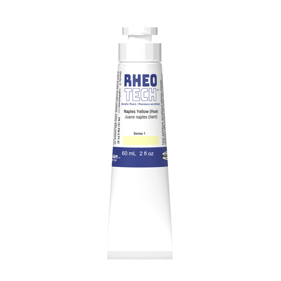
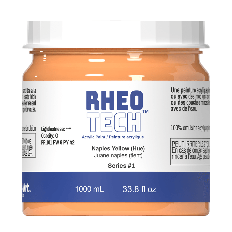
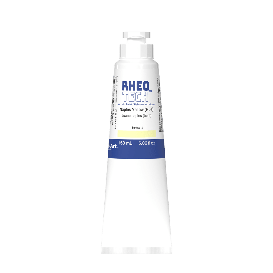
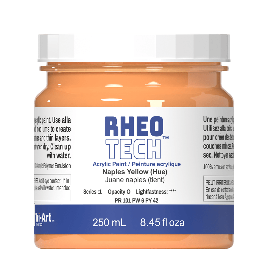

Rheotech - Naples Yellow (Hue)
About Acrylic Paint
This explains what acrylic paint is, and why our acrylic films are dependable over time.
What acrylic paint actually is
Acrylic paint is pigment dispersed in an acrylic polymer emulsion. As water evaporates, the acrylic particles coalesce into a continuous, flexible film that locks pigment in place and adheres to the surface.
Our binder and manufacturing approach
Tri-Art paints are 100% acrylic polymer emulsion products. We manufacture using a custom high-solids acrylic resin, and this binder standard applies across our range, including professional and student quality.
Using water confidently
Because our acrylic films are built on a high-solids acrylic resin system, artists can be more comfortable using water as a working medium without feeling like they are automatically compromising film integrity. For very thin applications, build in controlled layers and let each layer dry before continuing.
Practical tip: if you are creating extremely thin washes for extended areas, consider alternating thin layers with normal-strength layers to maintain a robust film build.

Flip it or unscrew it.
Your Tri-Art tube has a dual-function cap — flip open or unscrew for use.
